Athleisure Branding; anuk
anuk’s branding focuses on balance, lifestyle, and sustainability, with a commitment to providing high-quality sportswear.
Team
2 x UX/UI Designer
Timeline
Jan - Apr 2023
Tools
Figma
Illustrate
Photoshop
Indesign
Brand Value
Abstract
•
Aesthetic
•
Balance
•
Calm
•
Earthy
•
Natural
•
Trendy
•
Abstract • Aesthetic • Balance • Calm • Earthy • Natural • Trendy •
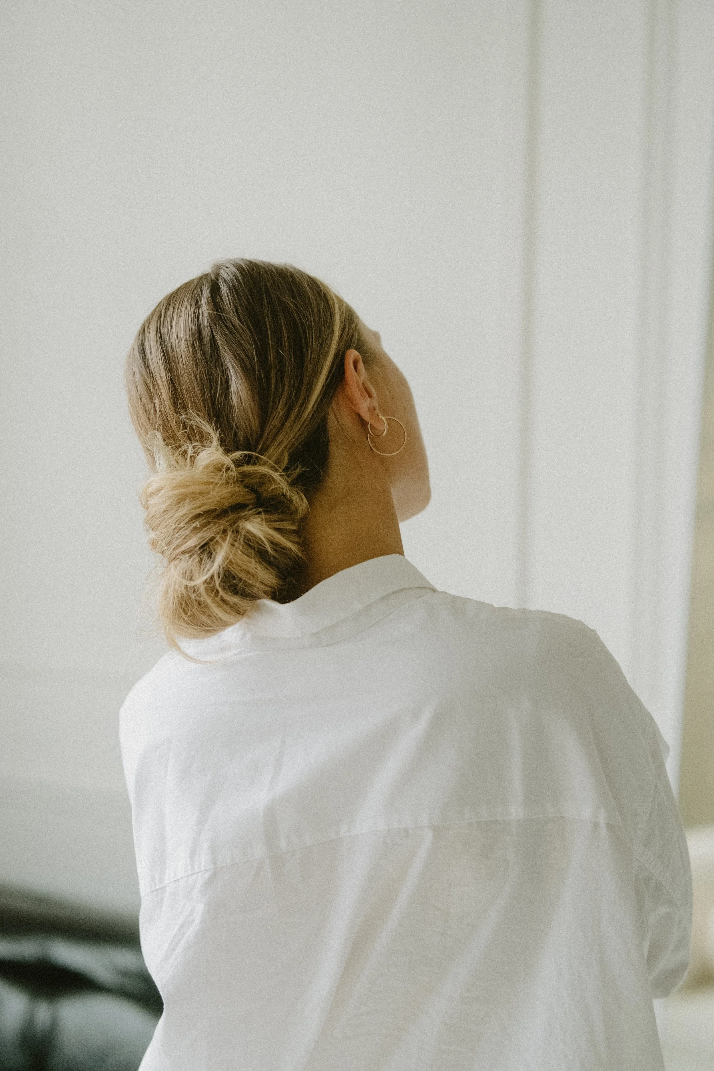
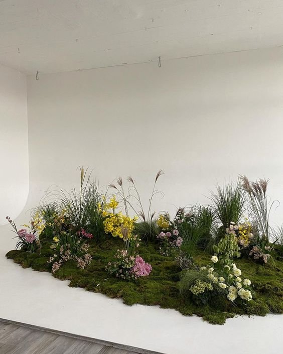
Mood Board

Logo
The logo system includes a series of graphic elements used at various times to create a comprehensive, cohesive, and recognizable identity that represents anuk’s brand image publicly.
Colour Palette
#F4CCC5
#808CC1
#BAC7B5
The colour system for anuk is carefully chosen to convey the brand’s identity and values. Warm pastel colours are welcoming, calming, and visually appealing, representing the brand’s a healthy and balanced lifestyle.
#EB997B
#4A6466
Typography
The font choices are not only visually appealing but also ensure readability and accessibility for our audience. Consistency in typography is key to strengthening our brand identity, and we believe our choices reflect the essence of anuk. We aim to create a seamless and cohesive brand experience for our audience, from the website to the marketing materials.
Application
We create technical garments that are worth talking about. Our products inspire authentic conversation focused on the innovations or features that make lifestyles more balanced and trendy.
Brand Guideline Website + Brand Book
This set of guidelines is designed to help you curate a consistent visual identity for anuk.
Remember that while we have crafted these elements to present us, our brand is actually the property of the public and their perception of anuk.


